

The goal of this odd project was to create an interactive experience visualizing data from different sources.
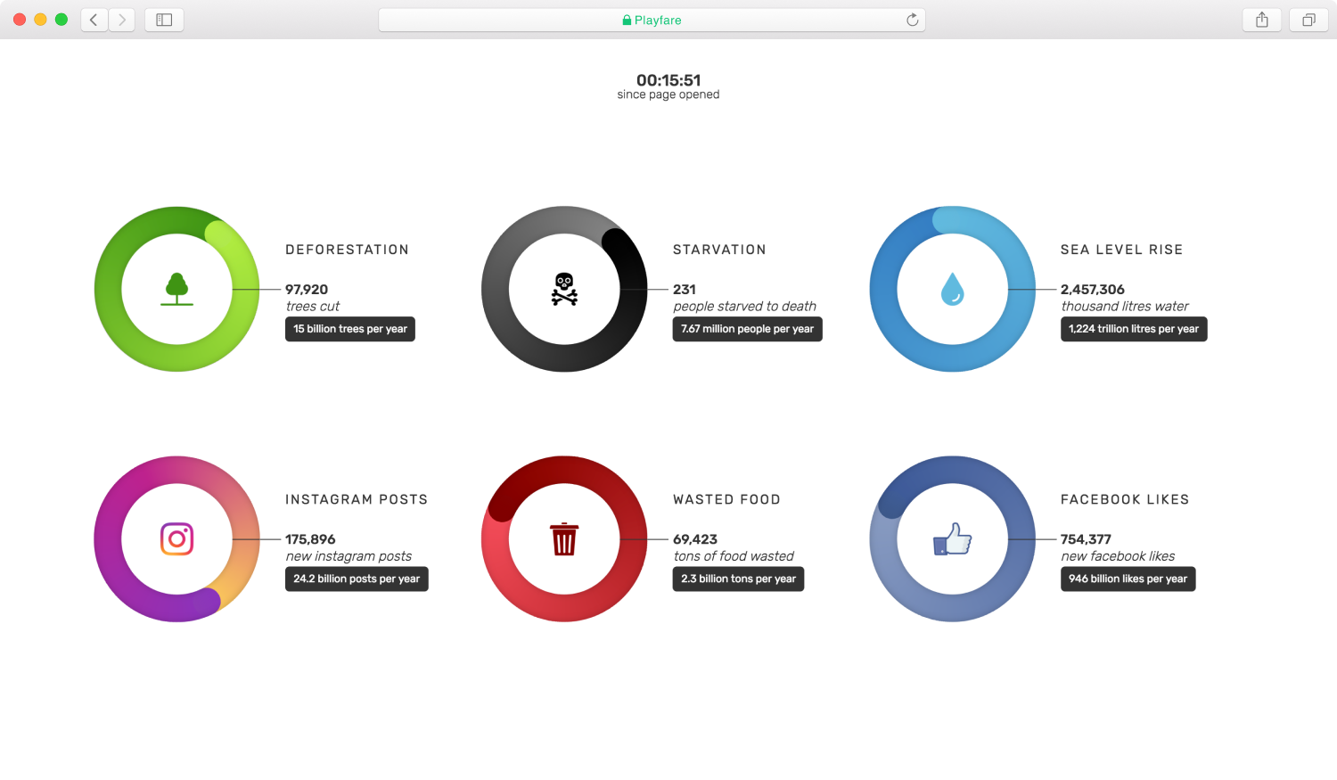
While ideating on the project I came across this report which states that on average a person in America spends over 10 hours each day behind a screen. To somewhat criticize this consumption Playfare aims to demonstrate the 'fare for playing' on the internet by gathering data from multiple sources and then juxtaposing it on a website.
Playfare
Data Visualization, Website
2017
2017
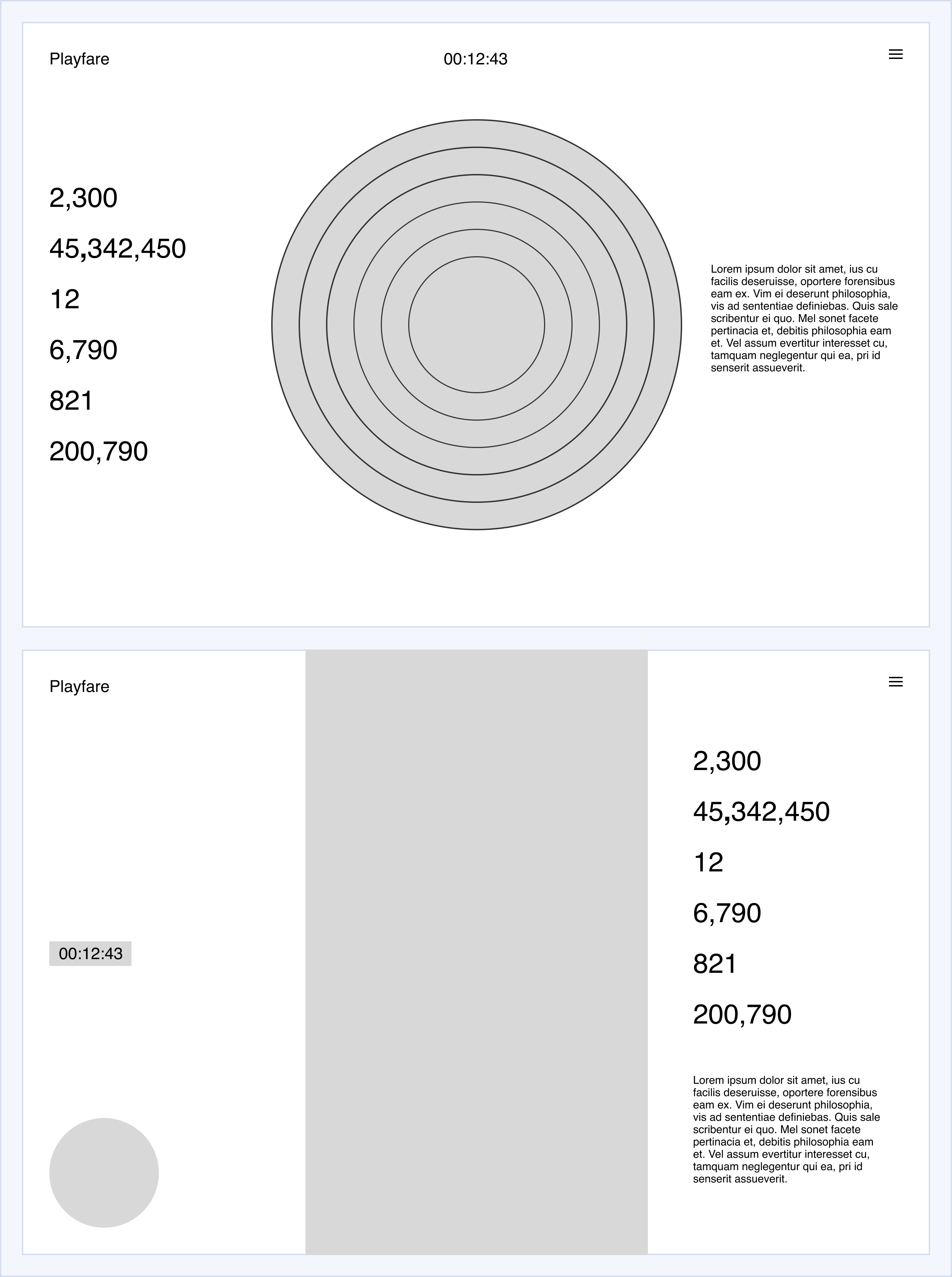
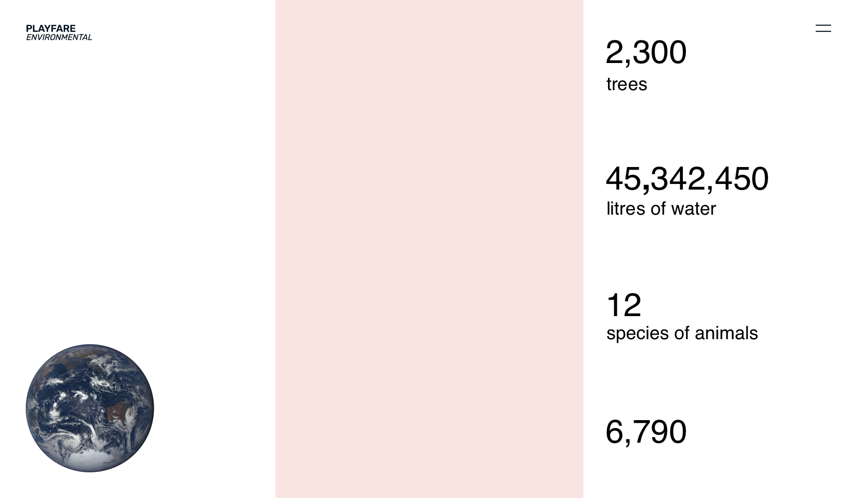
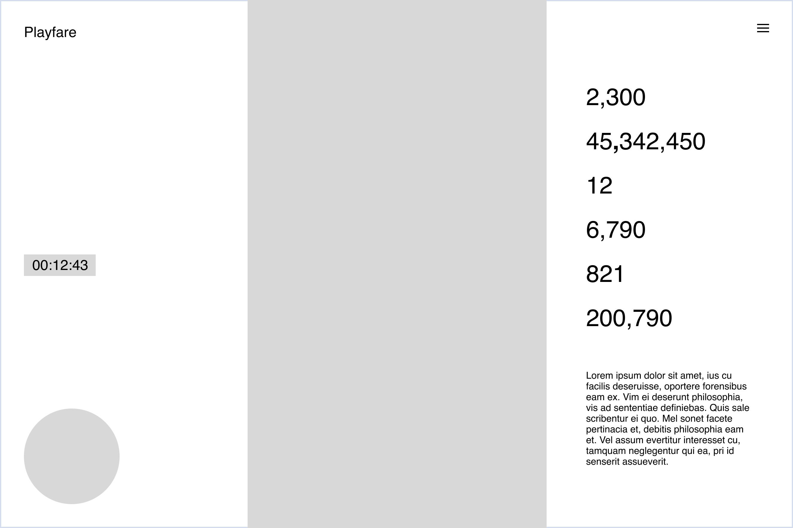
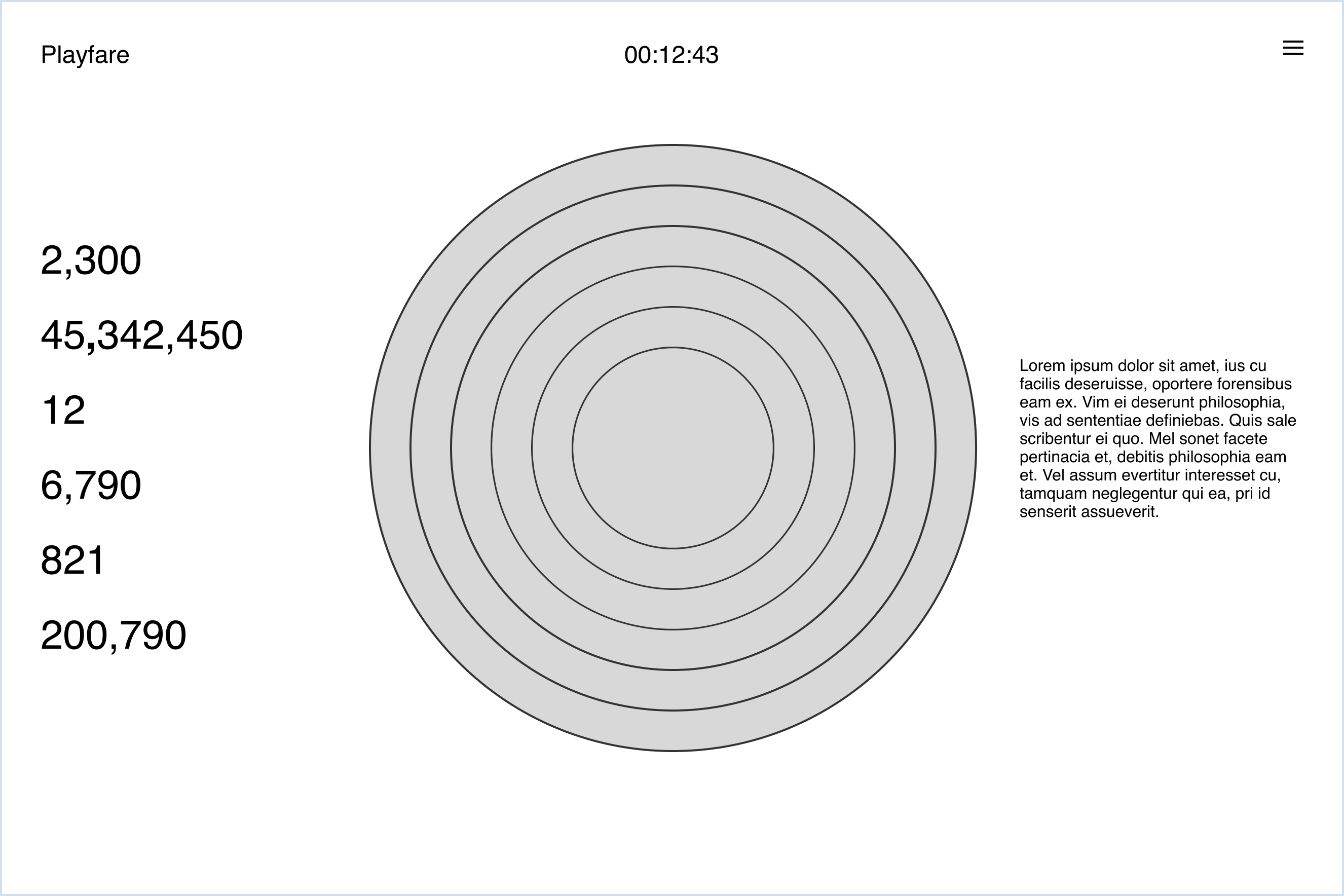
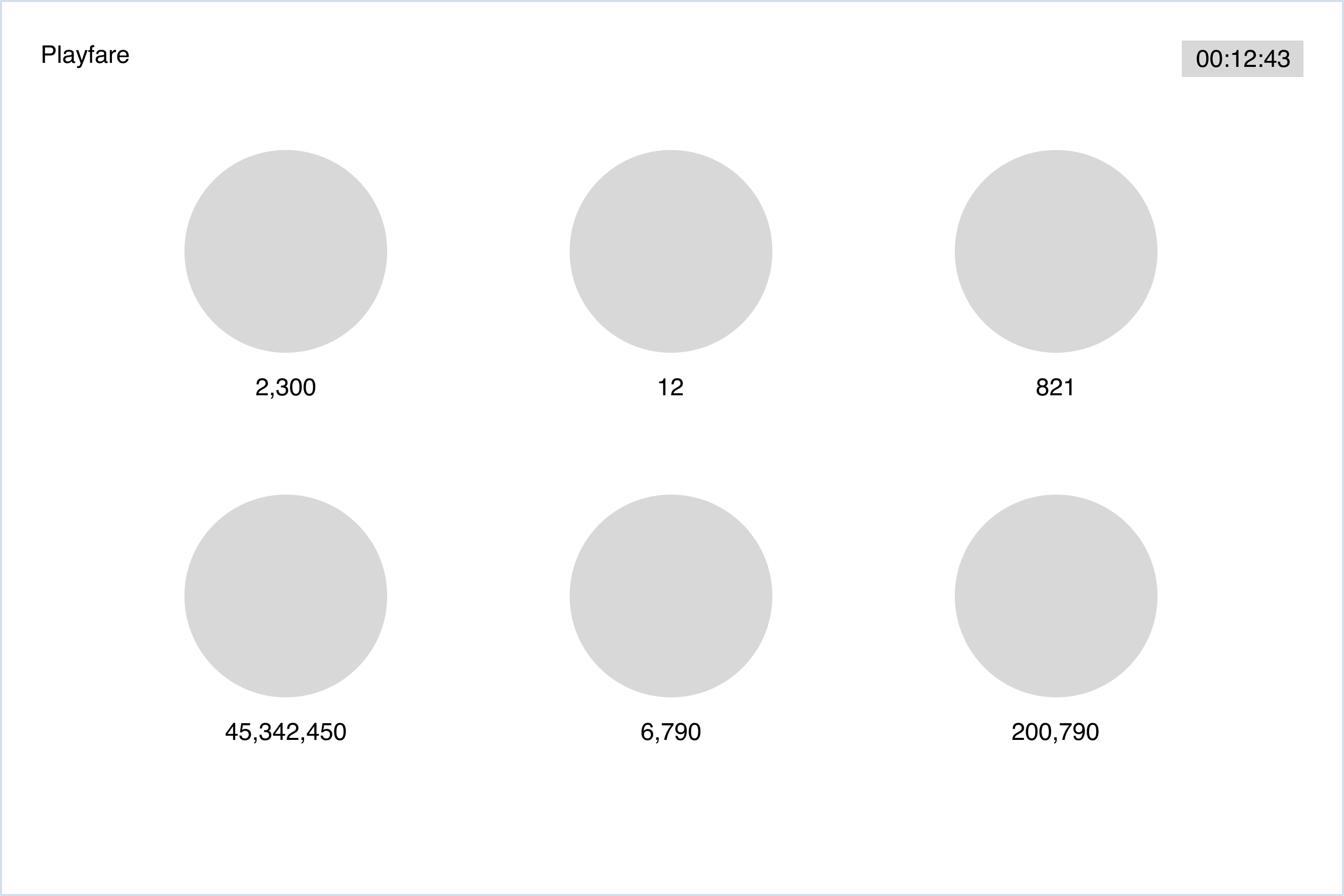
The visualization shows change happening to certain factors while viewers are simply on the website. The statistics shown constantly aggregate from when the page is loaded.
The project is live here.
The project is live here.
Nielson (2016)
The Total Audience Report
The Total Audience Report
Nasa (2020)
Vital Signs of the Planet: Sea Level
Vital Signs of the Planet: Sea Level
Nasa (2020)
Vital Signs of the Planet: Evidence
Vital Signs of the Planet: Evidence
TIME (2015)
Here's How Many Trees Humans Cut Down Each Year
Here's How Many Trees Humans Cut Down Each Year
Nature (2015)
Mapping tree density at a global scale
Mapping tree density at a global scale
World Wide Life (2015)
Deforestation and Forest Degradation
Deforestation and Forest Degradation